
Work
About
Contact
Building a Solar Website Entirely with ChatGPT Sites
August 22, 2026
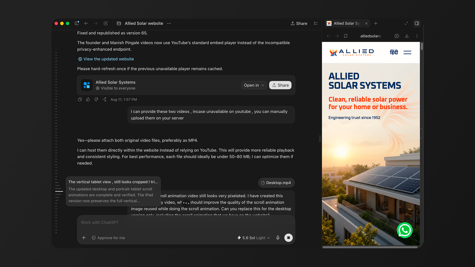
What started with a logo, presentation and client videos became a responsive, bilingual website with scroll animations, lead generation and WhatsApp integration, brought to life through an ongoing collaboration between a designer and AI.
From a Logo to a Live Website: Building Allied Solar Systems with ChatGPT Sites
I recently designed and launched the new website for Allied Solar Systems using ChatGPT Sites.
The project began with fairly raw ingredients: a complex logo, a company presentation, information about the founder, photographs of completed projects and a collection of client testimonial videos. There was no ready-made design system or fully resolved website structure. We had to build both from the ground up.
What followed was not a one-prompt website-generation exercise. It was a long, collaborative process involving dozens of design and development iterations across desktop, tablet and mobile. I was working as the designer, brand interpreter and client partner, while AI became the technology partner helping me turn decisions into a functioning website.
“AI could build and adapt the website quickly, but it still needed a designer to define the logic, understand the client and decide what the experience should communicate.”
Starting with the business, not the interface
Before thinking about screens, I needed to understand Allied Solar Systems as a business.
The company brings decades of engineering experience into solar energy. Its work ranges from home rooftops and housing societies to commercial installations, solar pumps, off-grid systems and long-term maintenance. The website therefore needed to do several things together: establish trust, explain the services, showcase projects, introduce the founder and convert interested visitors into leads.
I worked through the available company material and developed the information architecture around the questions a potential customer would naturally ask:
- Why should I consider solar?
- Which service is relevant to me?
- Can I trust this company?
- What projects have they completed?
- What do existing customers say?
- How do I request an assessment?
This gave the website a clear journey instead of making it feel like a digital brochure.
Translating a complex logo into a simple visual system
One of the most interesting design challenges was the Allied Solar Systems logo. It combines a phoenix, the sun, a solar panel and a strong engineering identity. It is visually rich and carries many ideas at once.
The website needed to respect that identity without repeating its complexity in every section.
I extracted a simpler visual language from it: deep engineering blue, energetic orange, warm sunlight, geometric solar-panel motifs and generous light backgrounds. The result feels more contemporary and futuristic, but it is still connected to the company’s Indian roots and long-standing engineering heritage.
Typography became another important part of this system. Oxanium was used for display moments to create an engineered, energy-driven character, while Manrope was used for body copy and interface elements to maintain clarity. The same design decisions were then applied consistently to buttons, cards, forms, icons, statistics, project information and responsive layouts.
Rather than designing isolated pages, we effectively built a small UI and brand system that the company can continue using across future web and social-media touchpoints.
Designing through prompting is still designing
It is easy to describe AI website creation as simply “writing a prompt and getting a website.” My experience was very different.
The site went through dozens of iterations. We adjusted alignment, spacing, font sizes, corner radii, contrast, hover states, button placement, card behaviour, video layouts, tablet cropping and mobile whitespace. We reviewed the English and Hindi experiences independently. We tested different treatments for project cards, founder content, service navigation, testimonials, forms and footers.
Each iteration required a design decision.
AI made the implementation cycle extremely fast. I could identify a problem visually, explain the intended behaviour in plain language and see it translated into the website. But deciding whether something felt trustworthy, balanced, legible or appropriate for the brand remained a human responsibility.
The prompts worked best when I explained the design logic; not only what to move, but why it needed to move and how the hierarchy should behave across breakpoints.
Responsive and bilingual by design
Creating responsive behaviour across desktop, tablet and mobile would traditionally require continuous coordination between design and development. With ChatGPT Sites, those conversations happened in the same workflow.
The website was adapted for wide desktop screens, vertically held tablets and smaller mobile devices. The work involved much more than shrinking content. Buttons had to move away from the animated focal points. Type scales needed to change. Project information had to remain legible. Video layouts had to stack correctly. Navigation and service menus needed to work with both touch and pointer interactions.
The bilingual experience added another layer.
Hindi text does not occupy the same amount of space as English text, and direct translations do not always feel natural. Labels, service names, calls to action, forms and supporting information had to be reconsidered in context. The website’s design system made it easier to keep the two versions visually consistent while giving each language enough room to work properly.
That was one of the most useful learnings for me: AI can make multilingual and responsive implementation significantly more accessible, but the designer still needs to review whether the language and layout feel natural to the people using them.
Turning a video into a scroll experience
The hero section became one of the most technically interesting parts of the project.
The idea was to show sunlight moving towards the solar panels, the panels generating energy and the house becoming illuminated as the visitor scrolls. The phoenix taken from the brand identity also becomes part of this visual narrative.
Creating the source animation still required the right creative talent and a high-quality video. AI did not replace that specialist work. What it did was make the next stage far more accessible.
The video was converted into an image sequence and connected to the page’s scroll position. Instead of the animation simply playing on a loop, the visitor controls its progress by scrolling. Separate visual sequences and responsive behaviour were created for desktop, tablet and mobile so that the solar panels, energy trail and house remained in focus.
We also had to make sure the full sequence completed before the visitor entered the next section. Text and calls to action were positioned so they did not interfere with the animation. Several rounds of testing were required to solve cropping, whitespace, overlap and image-quality issues.
This was a good example of AI acting as an implementation partner. I could focus on the story and interaction I wanted, while the system handled frame extraction, responsive logic and scroll-based playback.
Regional-language testimonials added real credibility
The client stories were especially important for this business.
Solar is a considered investment. Visitors are not only looking for specifications; they want evidence that the installer is dependable, understands local conditions and will remain accountable after installation.
We included vertical YouTube videos from customers speaking in regional languages. That made the website feel more authentic than polished, generic testimonials would have. The customers were real, the locations were recognisable and the experiences felt grounded in the communities Allied serves.
There were practical challenges here too. Some YouTube links changed, some videos became unavailable and vertical Shorts needed to work within responsive card layouts. The experience reinforced the importance of having a clear content workflow; especially for growing businesses whose digital assets may still be spread across phones, Drive folders and social-media accounts.
Connecting the website to real business actions
The website was never intended to be only a visual showcase.
We created a lead-generation form that collects the essential information required for an initial solar assessment. The experience then connects naturally to WhatsApp, which is already familiar to the company and its customers.
This made the website useful without forcing the business to adopt a complicated new sales platform immediately. Visitors can understand the service, see previous work, hear from customers and begin a conversation using a channel they already trust.
The contact experience, form logic, mobile behaviour and WhatsApp connection were all handled within the same AI-assisted implementation process.
From ChatGPT Sites to a GoDaddy domain
Publishing the website was another learning experience for me as a designer.
The project was first previewed locally so that changes could be reviewed without affecting the public website. It was then built and published through ChatGPT Sites. After that, the final site was connected to the company’s GoDaddy domain by configuring the required DNS records.
Before this project, terms such as DNS records, deployment versions, responsive media sequences and hosting configuration could easily feel like a separate technical world. Working alongside AI made them easier to understand because each task was connected to a visible design outcome.
I was not expected to become a full-time developer or infrastructure specialist. But I gained enough exposure to understand how a designed interface travels from a local preview to a live domain and that knowledge makes me a stronger digital designer.
AI as a technology partner, not a substitute for design
The biggest takeaway from this project is not that AI can create a website without people.
It is that AI can dramatically reduce the distance between a design decision and a working implementation.
I still had to understand the client, organise the content, determine the information hierarchy, develop the visual language, coordinate assets, review every breakpoint and decide what the final experience should feel like. The client relationship, strategic judgment and design direction could not be delegated to a prompt.
What changed was my ability to execute.
I could share visual references, describe an interaction, review the result and refine it immediately. I could work through accessibility, bilingual content, responsive layouts, animation, forms, video embeds, hosting and domain configuration within one collaborative environment.
The final website is therefore not something AI created for me. It is something I created with AI.
And for me, that is where the real opportunity lies: designers can move beyond handing over static screens and participate directly in building the complete experience from the first brand decision to the moment the website goes live.

Connect with us to explore your project's potential.



Building a Solar Website Entirely with ChatGPT Sites
August 22, 2026
What started with a logo, presentation and client videos became a responsive, bilingual website with scroll animations, lead generation and WhatsApp integration, brought to life through an ongoing collaboration between a designer and AI.
From a Logo to a Live Website: Building Allied Solar Systems with ChatGPT Sites
I recently designed and launched the new website for Allied Solar Systems using ChatGPT Sites.
The project began with fairly raw ingredients: a complex logo, a company presentation, information about the founder, photographs of completed projects and a collection of client testimonial videos. There was no ready-made design system or fully resolved website structure. We had to build both from the ground up.
What followed was not a one-prompt website-generation exercise. It was a long, collaborative process involving dozens of design and development iterations across desktop, tablet and mobile. I was working as the designer, brand interpreter and client partner, while AI became the technology partner helping me turn decisions into a functioning website.
“AI could build and adapt the website quickly, but it still needed a designer to define the logic, understand the client and decide what the experience should communicate.”
Starting with the business, not the interface
Before thinking about screens, I needed to understand Allied Solar Systems as a business.
The company brings decades of engineering experience into solar energy. Its work ranges from home rooftops and housing societies to commercial installations, solar pumps, off-grid systems and long-term maintenance. The website therefore needed to do several things together: establish trust, explain the services, showcase projects, introduce the founder and convert interested visitors into leads.
I worked through the available company material and developed the information architecture around the questions a potential customer would naturally ask:
- Why should I consider solar?
- Which service is relevant to me?
- Can I trust this company?
- What projects have they completed?
- What do existing customers say?
- How do I request an assessment?
This gave the website a clear journey instead of making it feel like a digital brochure.
Translating a complex logo into a simple visual system
One of the most interesting design challenges was the Allied Solar Systems logo. It combines a phoenix, the sun, a solar panel and a strong engineering identity. It is visually rich and carries many ideas at once.
The website needed to respect that identity without repeating its complexity in every section.
I extracted a simpler visual language from it: deep engineering blue, energetic orange, warm sunlight, geometric solar-panel motifs and generous light backgrounds. The result feels more contemporary and futuristic, but it is still connected to the company’s Indian roots and long-standing engineering heritage.
Typography became another important part of this system. Oxanium was used for display moments to create an engineered, energy-driven character, while Manrope was used for body copy and interface elements to maintain clarity. The same design decisions were then applied consistently to buttons, cards, forms, icons, statistics, project information and responsive layouts.
Rather than designing isolated pages, we effectively built a small UI and brand system that the company can continue using across future web and social-media touchpoints.
Designing through prompting is still designing
It is easy to describe AI website creation as simply “writing a prompt and getting a website.” My experience was very different.
The site went through dozens of iterations. We adjusted alignment, spacing, font sizes, corner radii, contrast, hover states, button placement, card behaviour, video layouts, tablet cropping and mobile whitespace. We reviewed the English and Hindi experiences independently. We tested different treatments for project cards, founder content, service navigation, testimonials, forms and footers.
Each iteration required a design decision.
AI made the implementation cycle extremely fast. I could identify a problem visually, explain the intended behaviour in plain language and see it translated into the website. But deciding whether something felt trustworthy, balanced, legible or appropriate for the brand remained a human responsibility.
The prompts worked best when I explained the design logic; not only what to move, but why it needed to move and how the hierarchy should behave across breakpoints.
Responsive and bilingual by design
Creating responsive behaviour across desktop, tablet and mobile would traditionally require continuous coordination between design and development. With ChatGPT Sites, those conversations happened in the same workflow.
The website was adapted for wide desktop screens, vertically held tablets and smaller mobile devices. The work involved much more than shrinking content. Buttons had to move away from the animated focal points. Type scales needed to change. Project information had to remain legible. Video layouts had to stack correctly. Navigation and service menus needed to work with both touch and pointer interactions.
The bilingual experience added another layer.
Hindi text does not occupy the same amount of space as English text, and direct translations do not always feel natural. Labels, service names, calls to action, forms and supporting information had to be reconsidered in context. The website’s design system made it easier to keep the two versions visually consistent while giving each language enough room to work properly.
That was one of the most useful learnings for me: AI can make multilingual and responsive implementation significantly more accessible, but the designer still needs to review whether the language and layout feel natural to the people using them.
Turning a video into a scroll experience
The hero section became one of the most technically interesting parts of the project.
The idea was to show sunlight moving towards the solar panels, the panels generating energy and the house becoming illuminated as the visitor scrolls. The phoenix taken from the brand identity also becomes part of this visual narrative.
Creating the source animation still required the right creative talent and a high-quality video. AI did not replace that specialist work. What it did was make the next stage far more accessible.
The video was converted into an image sequence and connected to the page’s scroll position. Instead of the animation simply playing on a loop, the visitor controls its progress by scrolling. Separate visual sequences and responsive behaviour were created for desktop, tablet and mobile so that the solar panels, energy trail and house remained in focus.
We also had to make sure the full sequence completed before the visitor entered the next section. Text and calls to action were positioned so they did not interfere with the animation. Several rounds of testing were required to solve cropping, whitespace, overlap and image-quality issues.
This was a good example of AI acting as an implementation partner. I could focus on the story and interaction I wanted, while the system handled frame extraction, responsive logic and scroll-based playback.
Regional-language testimonials added real credibility
The client stories were especially important for this business.
Solar is a considered investment. Visitors are not only looking for specifications; they want evidence that the installer is dependable, understands local conditions and will remain accountable after installation.
We included vertical YouTube videos from customers speaking in regional languages. That made the website feel more authentic than polished, generic testimonials would have. The customers were real, the locations were recognisable and the experiences felt grounded in the communities Allied serves.
There were practical challenges here too. Some YouTube links changed, some videos became unavailable and vertical Shorts needed to work within responsive card layouts. The experience reinforced the importance of having a clear content workflow; especially for growing businesses whose digital assets may still be spread across phones, Drive folders and social-media accounts.
Connecting the website to real business actions
The website was never intended to be only a visual showcase.
We created a lead-generation form that collects the essential information required for an initial solar assessment. The experience then connects naturally to WhatsApp, which is already familiar to the company and its customers.
This made the website useful without forcing the business to adopt a complicated new sales platform immediately. Visitors can understand the service, see previous work, hear from customers and begin a conversation using a channel they already trust.
The contact experience, form logic, mobile behaviour and WhatsApp connection were all handled within the same AI-assisted implementation process.
From ChatGPT Sites to a GoDaddy domain
Publishing the website was another learning experience for me as a designer.
The project was first previewed locally so that changes could be reviewed without affecting the public website. It was then built and published through ChatGPT Sites. After that, the final site was connected to the company’s GoDaddy domain by configuring the required DNS records.
Before this project, terms such as DNS records, deployment versions, responsive media sequences and hosting configuration could easily feel like a separate technical world. Working alongside AI made them easier to understand because each task was connected to a visible design outcome.
I was not expected to become a full-time developer or infrastructure specialist. But I gained enough exposure to understand how a designed interface travels from a local preview to a live domain and that knowledge makes me a stronger digital designer.
AI as a technology partner, not a substitute for design
The biggest takeaway from this project is not that AI can create a website without people.
It is that AI can dramatically reduce the distance between a design decision and a working implementation.
I still had to understand the client, organise the content, determine the information hierarchy, develop the visual language, coordinate assets, review every breakpoint and decide what the final experience should feel like. The client relationship, strategic judgment and design direction could not be delegated to a prompt.
What changed was my ability to execute.
I could share visual references, describe an interaction, review the result and refine it immediately. I could work through accessibility, bilingual content, responsive layouts, animation, forms, video embeds, hosting and domain configuration within one collaborative environment.
The final website is therefore not something AI created for me. It is something I created with AI.
And for me, that is where the real opportunity lies: designers can move beyond handing over static screens and participate directly in building the complete experience from the first brand decision to the moment the website goes live.

Connect with us to explore your project's potential.


Building a Solar Website Entirely with ChatGPT Sites
August 22, 2026
What started with a logo, presentation and client videos became a responsive, bilingual website with scroll animations, lead generation and WhatsApp integration, brought to life through an ongoing collaboration between a designer and AI.
From a Logo to a Live Website: Building Allied Solar Systems with ChatGPT Sites
I recently designed and launched the new website for Allied Solar Systems using ChatGPT Sites.
The project began with fairly raw ingredients: a complex logo, a company presentation, information about the founder, photographs of completed projects and a collection of client testimonial videos. There was no ready-made design system or fully resolved website structure. We had to build both from the ground up.
What followed was not a one-prompt website-generation exercise. It was a long, collaborative process involving dozens of design and development iterations across desktop, tablet and mobile. I was working as the designer, brand interpreter and client partner, while AI became the technology partner helping me turn decisions into a functioning website.
“AI could build and adapt the website quickly, but it still needed a designer to define the logic, understand the client and decide what the experience should communicate.”
Starting with the business, not the interface
Before thinking about screens, I needed to understand Allied Solar Systems as a business.
The company brings decades of engineering experience into solar energy. Its work ranges from home rooftops and housing societies to commercial installations, solar pumps, off-grid systems and long-term maintenance. The website therefore needed to do several things together: establish trust, explain the services, showcase projects, introduce the founder and convert interested visitors into leads.
I worked through the available company material and developed the information architecture around the questions a potential customer would naturally ask:
- Why should I consider solar?
- Which service is relevant to me?
- Can I trust this company?
- What projects have they completed?
- What do existing customers say?
- How do I request an assessment?
This gave the website a clear journey instead of making it feel like a digital brochure.
Translating a complex logo into a simple visual system
One of the most interesting design challenges was the Allied Solar Systems logo. It combines a phoenix, the sun, a solar panel and a strong engineering identity. It is visually rich and carries many ideas at once.
The website needed to respect that identity without repeating its complexity in every section.
I extracted a simpler visual language from it: deep engineering blue, energetic orange, warm sunlight, geometric solar-panel motifs and generous light backgrounds. The result feels more contemporary and futuristic, but it is still connected to the company’s Indian roots and long-standing engineering heritage.
Typography became another important part of this system. Oxanium was used for display moments to create an engineered, energy-driven character, while Manrope was used for body copy and interface elements to maintain clarity. The same design decisions were then applied consistently to buttons, cards, forms, icons, statistics, project information and responsive layouts.
Rather than designing isolated pages, we effectively built a small UI and brand system that the company can continue using across future web and social-media touchpoints.
Designing through prompting is still designing
It is easy to describe AI website creation as simply “writing a prompt and getting a website.” My experience was very different.
The site went through dozens of iterations. We adjusted alignment, spacing, font sizes, corner radii, contrast, hover states, button placement, card behaviour, video layouts, tablet cropping and mobile whitespace. We reviewed the English and Hindi experiences independently. We tested different treatments for project cards, founder content, service navigation, testimonials, forms and footers.
Each iteration required a design decision.
AI made the implementation cycle extremely fast. I could identify a problem visually, explain the intended behaviour in plain language and see it translated into the website. But deciding whether something felt trustworthy, balanced, legible or appropriate for the brand remained a human responsibility.
The prompts worked best when I explained the design logic; not only what to move, but why it needed to move and how the hierarchy should behave across breakpoints.
Responsive and bilingual by design
Creating responsive behaviour across desktop, tablet and mobile would traditionally require continuous coordination between design and development. With ChatGPT Sites, those conversations happened in the same workflow.
The website was adapted for wide desktop screens, vertically held tablets and smaller mobile devices. The work involved much more than shrinking content. Buttons had to move away from the animated focal points. Type scales needed to change. Project information had to remain legible. Video layouts had to stack correctly. Navigation and service menus needed to work with both touch and pointer interactions.
The bilingual experience added another layer.
Hindi text does not occupy the same amount of space as English text, and direct translations do not always feel natural. Labels, service names, calls to action, forms and supporting information had to be reconsidered in context. The website’s design system made it easier to keep the two versions visually consistent while giving each language enough room to work properly.
That was one of the most useful learnings for me: AI can make multilingual and responsive implementation significantly more accessible, but the designer still needs to review whether the language and layout feel natural to the people using them.
Turning a video into a scroll experience
The hero section became one of the most technically interesting parts of the project.
The idea was to show sunlight moving towards the solar panels, the panels generating energy and the house becoming illuminated as the visitor scrolls. The phoenix taken from the brand identity also becomes part of this visual narrative.
Creating the source animation still required the right creative talent and a high-quality video. AI did not replace that specialist work. What it did was make the next stage far more accessible.
The video was converted into an image sequence and connected to the page’s scroll position. Instead of the animation simply playing on a loop, the visitor controls its progress by scrolling. Separate visual sequences and responsive behaviour were created for desktop, tablet and mobile so that the solar panels, energy trail and house remained in focus.
We also had to make sure the full sequence completed before the visitor entered the next section. Text and calls to action were positioned so they did not interfere with the animation. Several rounds of testing were required to solve cropping, whitespace, overlap and image-quality issues.
This was a good example of AI acting as an implementation partner. I could focus on the story and interaction I wanted, while the system handled frame extraction, responsive logic and scroll-based playback.
Regional-language testimonials added real credibility
The client stories were especially important for this business.
Solar is a considered investment. Visitors are not only looking for specifications; they want evidence that the installer is dependable, understands local conditions and will remain accountable after installation.
We included vertical YouTube videos from customers speaking in regional languages. That made the website feel more authentic than polished, generic testimonials would have. The customers were real, the locations were recognisable and the experiences felt grounded in the communities Allied serves.
There were practical challenges here too. Some YouTube links changed, some videos became unavailable and vertical Shorts needed to work within responsive card layouts. The experience reinforced the importance of having a clear content workflow; especially for growing businesses whose digital assets may still be spread across phones, Drive folders and social-media accounts.
Connecting the website to real business actions
The website was never intended to be only a visual showcase.
We created a lead-generation form that collects the essential information required for an initial solar assessment. The experience then connects naturally to WhatsApp, which is already familiar to the company and its customers.
This made the website useful without forcing the business to adopt a complicated new sales platform immediately. Visitors can understand the service, see previous work, hear from customers and begin a conversation using a channel they already trust.
The contact experience, form logic, mobile behaviour and WhatsApp connection were all handled within the same AI-assisted implementation process.
From ChatGPT Sites to a GoDaddy domain
Publishing the website was another learning experience for me as a designer.
The project was first previewed locally so that changes could be reviewed without affecting the public website. It was then built and published through ChatGPT Sites. After that, the final site was connected to the company’s GoDaddy domain by configuring the required DNS records.
Before this project, terms such as DNS records, deployment versions, responsive media sequences and hosting configuration could easily feel like a separate technical world. Working alongside AI made them easier to understand because each task was connected to a visible design outcome.
I was not expected to become a full-time developer or infrastructure specialist. But I gained enough exposure to understand how a designed interface travels from a local preview to a live domain and that knowledge makes me a stronger digital designer.
AI as a technology partner, not a substitute for design
The biggest takeaway from this project is not that AI can create a website without people.
It is that AI can dramatically reduce the distance between a design decision and a working implementation.
I still had to understand the client, organise the content, determine the information hierarchy, develop the visual language, coordinate assets, review every breakpoint and decide what the final experience should feel like. The client relationship, strategic judgment and design direction could not be delegated to a prompt.
What changed was my ability to execute.
I could share visual references, describe an interaction, review the result and refine it immediately. I could work through accessibility, bilingual content, responsive layouts, animation, forms, video embeds, hosting and domain configuration within one collaborative environment.
The final website is therefore not something AI created for me. It is something I created with AI.
And for me, that is where the real opportunity lies: designers can move beyond handing over static screens and participate directly in building the complete experience from the first brand decision to the moment the website goes live.

Connect with us to explore your project's potential.

